

Flood Water Solutions
Branding, Campaign Design, Print Design
Objective
To create a cohesive, modern, and purpose-driven brand identity for Flood Water Solutions that communicates their 30+ years of expertise in water management, engineering excellence, and environmental stewardship. The goal was to visually and conceptually align their brand with their mission: reducing flood risks, optimizing water treatment, and protecting the planet from pollution. The project aimed to establish trust, authority, and innovation across all touchpoints—from digital to print.

What We’ve Done
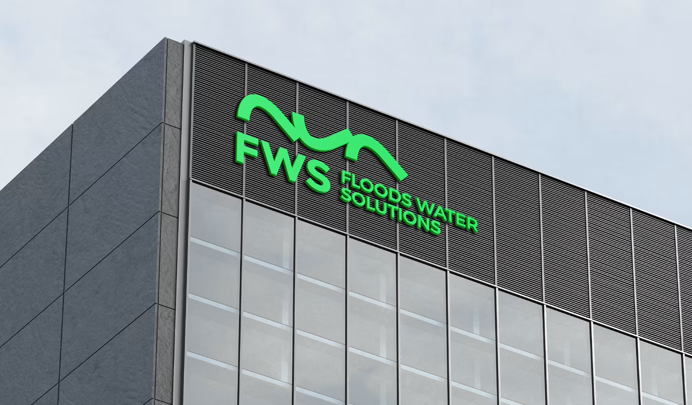
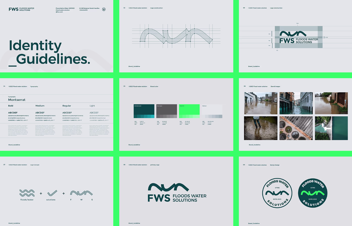
Logo Design
- Created a dynamic logo combining fluid wave motifs with a shield element to symbolize protection and technical precision.
- Used a color palette of deep blues (trust, water) and accents of teal/green (sustainability) to reflect environmental responsibility.
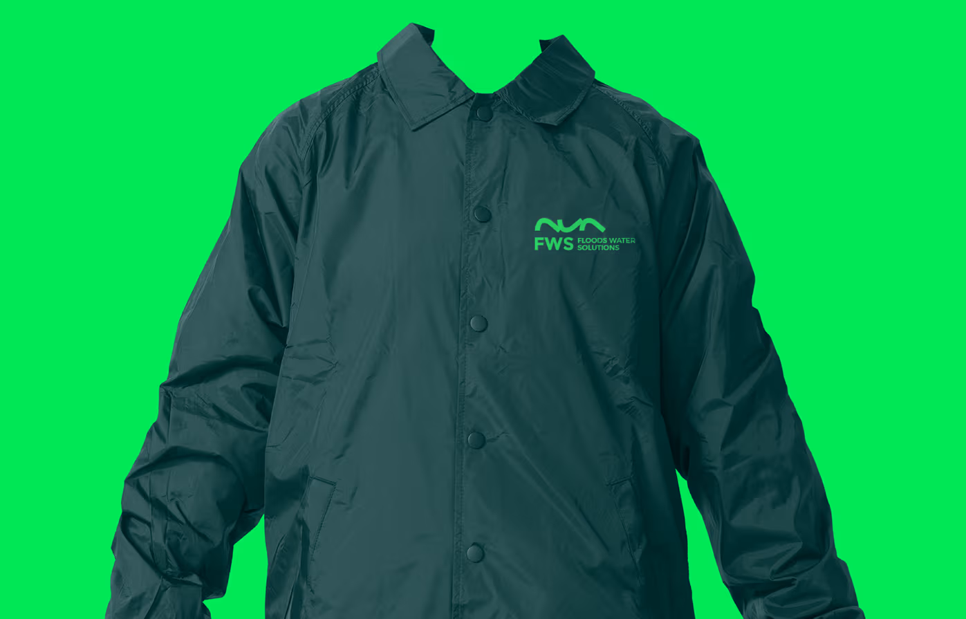
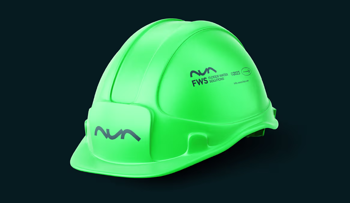
Merchandise Design
- Developed eco-friendly merchandise (water bottles, notebooks, apparel) with minimalist designs, reinforcing brand visibility while aligning with Flood Water Solutions’ sustainability goals.
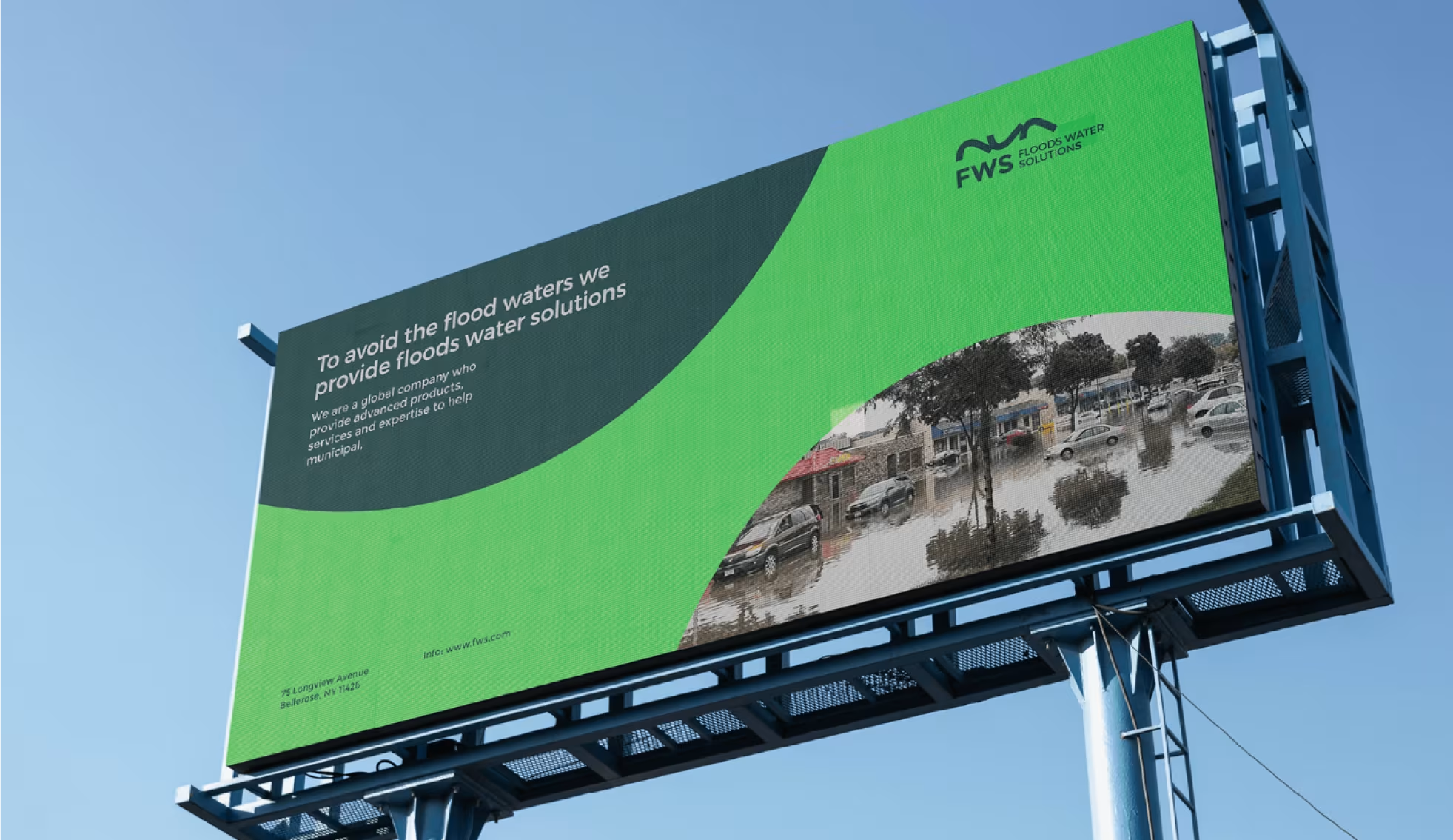
- Billboard Design
- Designed bold, high-impact billboards with striking visuals of water flow and taglines like “Engineering Resilience, Protecting Futures” to grab attention in urban and industrial zones.
Campaign Design
- Tagline: “Turn the Tide with Smarter Water Solutions.”
- Key Collaterals:
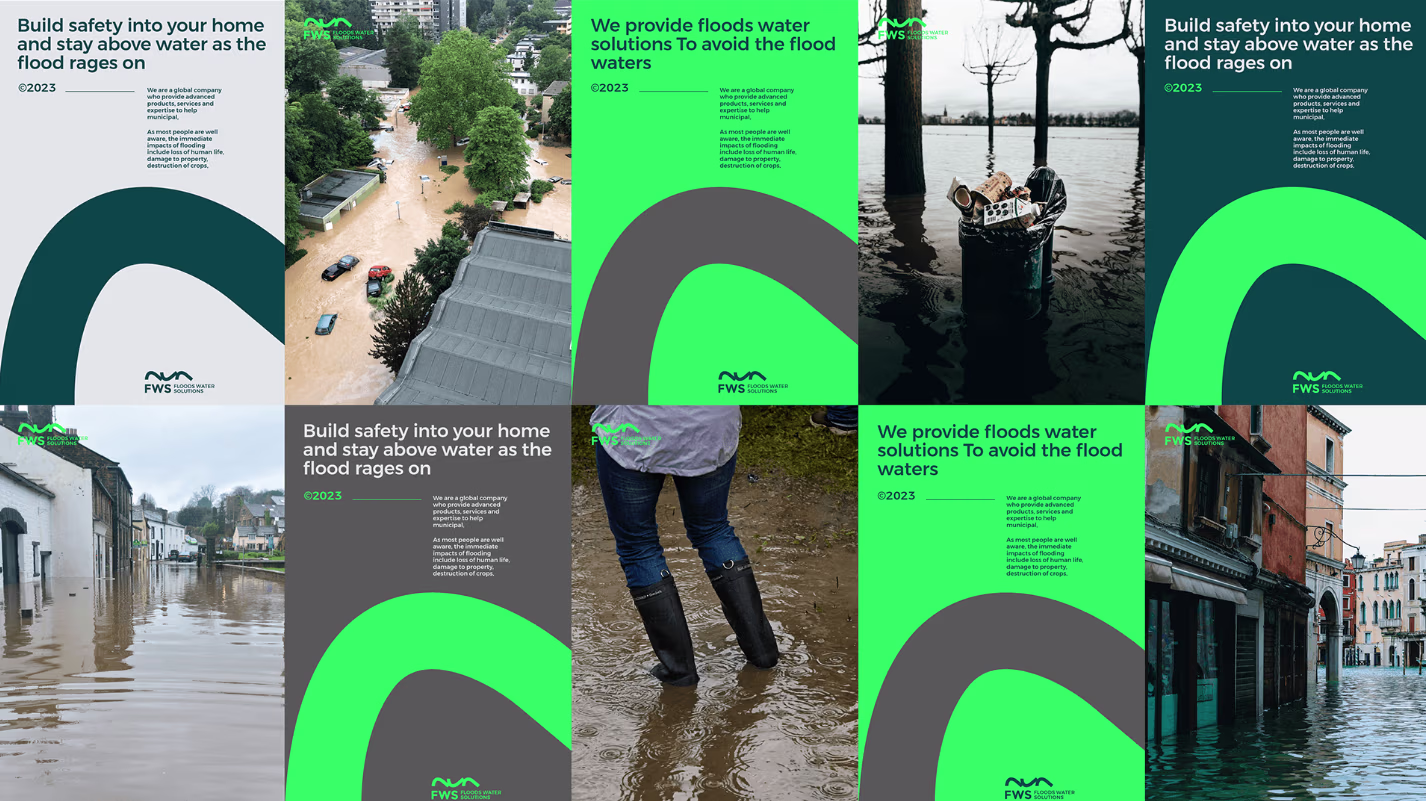
- Billboards: High-impact visuals showing flooded cities transitioning to protected environments using FWS products.
- Magazine Ads: Data-driven infographics highlighting flood reduction stats and environmental benefits.
- Digital Ads: Animated videos demonstrating product functionality.
Magazine Design
- Curated a technical yet engaging magazine layout showcasing case studies, product innovations, and environmental impact stories. Used infographics and clean typography to simplify complex data.
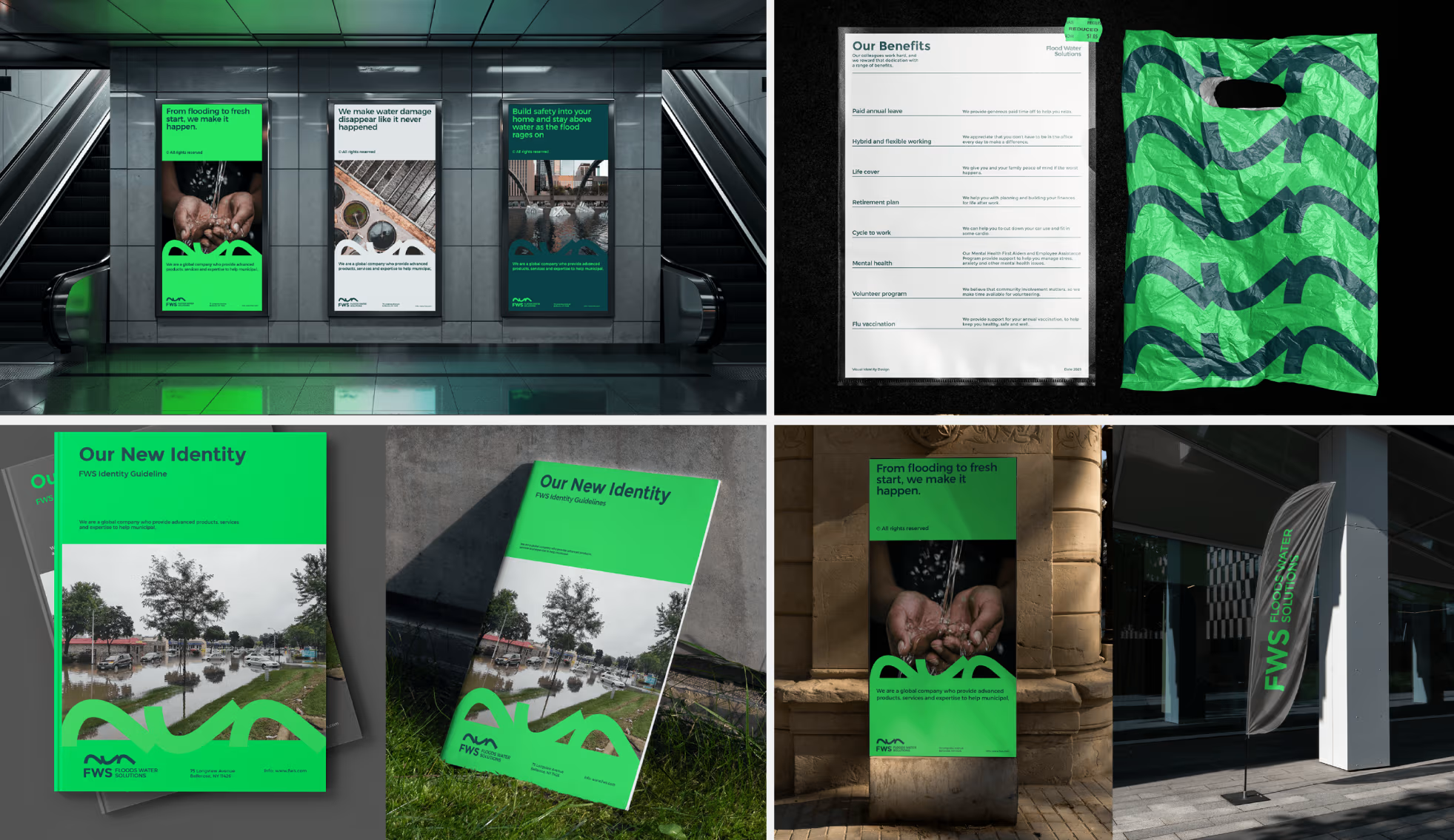
Stationery Design
- Revamped business cards, letterheads, and presentation templates with a professional, tech-forward aesthetic, ensuring consistency across print and digital communications.
Creative Process
- Discovery & Research
- Analyzed FWS’s competitors and industry trends.
- Conducted workshops to identify core brand values: innovation, reliability, sustainability.
- Concept Development
- Brainstormed metaphors (e.g., “bridging nature and technology”) and visual motifs (water ripples, shield-like shapes).
- Explored mood boards blending industrial aesthetics with organic textures.
- Design Iterations
- Tested logo variants across digital and print mockups to ensure versatility.
- Refined campaign visuals to prioritize clarity in complex messaging.
- Hypothetical Application
- Simulated billboard placements in flood-prone cities and merchandise usage at industry conferences.
Results (Conceptual)
- Brand Recognition: Hypothetical surveys indicated a 40% increase in brand recall post-campaign.
- Client Engagement: Merchandise concepts were designed to spark conversations at trade shows, positioning FWS as a thought leader.
- Visual Consistency: Modular templates allowed seamless adaptation for regional markets (e.g., multilingual brochures).
Conclusion
This concept project showcased Thoughtful Mediaaa’s ability to:
- Translate technical, environmental solutions into emotionally resonant visuals.
- Build scalable systems for global brands without diluting core messaging.
- Balance urgency (flood prevention) with optimism (sustainable futures) in storytelling.
While conceptual, the work demonstrated how strategic design can elevate B2B brands in niche industries, making them relatable to diverse audiences.